A very good article about pagination in your web app.
Pagination 101
« · By Faruk Ateş on Jun 22, 2007
One of the most commonly overlooked and under-refined elements of a website is its pagination controls. In many cases, these are treated as an afterthought. I rarely come across a website that has decent pagination, and it always makes me wonder why so few manage to get it right. After all, I’d say that pagination is pretty easy to get right. Alas, that doesn’t seem the case, so after encouragement from Chris Messina on Flickr I decided to write my Pagination 101, hopefully it’ll give you some clues as to what makes good pagination.
Before going into analyzing good and bad pagination, I want to explain just what I consider to be pagination: Pagination is any kind of control system that lets the user browse through pages of search results, archives, or any other kind of continued content. Search results are the obvious example, but it’s good to realize that pagination is also found on blogs (Previous/Next post links, which some blogs have), discussion boards and — significantly so — on web comics.
The importance of pagination is subjective; it depends on the content as well. For Google or Yahoo!’s search results, pagination is pretty important because as much as they want to give you exactly what you search for in the first 10 or 20 results, there simply are plenty of times when you’ll sift through consecutive pages. For a web comic, it doesn’t make much sense to jump to “page 7” when you’re on page 2; you want to just go to the next comic easily. So pagination is content-sensitive, but interestingly the basic principles of good pagination apply no matter what the content or context is.
Rules for good pagination
Making good pagination is not a difficult thing. Really, you just want to remember the following basic guidelines, and you should be fine. We’ll look at a large range of examples after that, to see what we can learn from existing pagination designs found on popular websites today.
This is a solid rule for any kind of navigational link, whether it’s a menu link or a pagination link, but in the context of pagination links this may be even more pertinent. Oftentimes, pagination is omitted from a design phase and ends up being stuffed somewhere in a corner above or below content areas, obviously not having been given much thought. One of the biggest problems resulting from this is that pagination links end up being small clickable areas, no larger than the page numbers themselves. To make them more effective and userfriendly, give them some proper visual design and give each link a large clickable area, that’s visually identifiable. By large, a good rule of thumb is “twice as wide as the number, and 1.5 times its height.”
Underlines for links are generally a good idea, as users are most familiar with links having underlines, but for pagination links as well as (obvious) main menu links, underlines are superfluous. People know that page numbers on the web are clickable (and if they aren’t, what are they doing there?)
Make the current page immediately identifiable for the user; it should not be clickable, it should not have any kind of visual hover-state, and it should (ideally) be wrapped in an em or strong element. The current page should be significantly different in style from the other pages, so that a user can easily keep track of where he or she is.
Provide enough space between each page link so that a user can not accidentally click on the wrong page number. Good visual design will help make this easier.
In virtually any context where pagination exists or can exist, Previous and Next links are useful to have. So offer them. But, separate them cleanly from the page numbers and give them sufficient distance or unique styling so that they can’t be mistaken as a page; this is particularly pertinent if you use arrows instead of text for Previous and Next.
When browsing page results outside of either boundary (or is that inside?), offer a First, a Last, or both First and Last links, whichever is appropriate. For web comics, it is appropriate to always offer both links, but disable the respective link when the user is on the First or Last page. Keep it visible as a text-only option, no link, no clickability, but keep it in the design. That applies to web comics only, not necessarily for other forms of pagination.
Nothing is more counter-intuitive than a Last link followed by a Next link. Look at stereo systems for example: fast-forward is followed by next track, because it is a superceding step. Time controls are ordered from the center out, and pagination controls are not very different from them (or in some cases, not different at all), and should thus follow the same basic rule. « First ‹ Previous Current Next › Last »
Examples, both good and bad
So we’ve got seven simple but clear rules to go by, let’s look at how some sites do their pagination and see what we can learn from them. Let’s start with the one I think is the most well-known of them all: Google’s search results

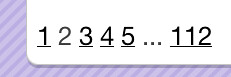
As cute as it is to stretch out the “oo” from “Google” to align with the number of pages, it creates a problem in that the page links are a bit too close for easy selection. Ever tried navigating them by clicking on the o’s instead of the numbers? It’s not convenient at all. The tenth and eleventh pages make this problem very clear, in particular. Google’s Previous and Next links, however, are fantastic — clearly separated and with plenty strong visual contrast with the regular page links. The links unfortunately all have underlines, producing some clutter which, again, makes the double digit page numbers very difficult to distinguish from one another. The clickable areas of the numbers are tiny, and the o’s are not easy to use.
Now, Google did another pagination somewhere else, which is the pagination that sparked all of this:

This time, the Previous and Next links aren’t much different at all — just a different font-weight — and the page links, albeit larger than their usual search results one, are still just tiny clickable areas that get cluttered the moment they hit double digits. The current page is pretty easily identified, but why on earth is it dropped down? A consistent baseline would have helped (also the case in the first example).

Overture uses a slightly different approach: no actual page numbers are clickable, but you get to see what page you’re on and how many pages there are. The First and Previous links are there as regular text, so that navigation has a consistent feel to it no matter what page the user is on. The fact that only Previous and Next have an arrow is a great touch, it makes them more inviting for the user to use, and the most likely use case scenario for Overture is that a user wants to go to a Next or Previous page, not the First or Last.

Veer does something interesting as well: simple (but frustratingly tiny) previous and next arrow buttons for browsing pages set around the current and total pages number; a drop-down for how many results per page you want and a text field to jump directly to any page in the set. The downside of a drop-down is that it has different looks in different browsers, giving a bit of an inconsistent and cluttered feel to the overall pagination area. It also lacks a consistent baseline thanks to the form controls and the buttons being oddly designed (the text labels in the image buttons does not align to the text outside of them). This simple section has five different baselines all at once.

Design Snack uses arrows for the First/Previous/Next/Last buttons, but the pagination would have benefitted from some slight differences between First and Previous, and Next and Last. The First and Last buttons could have been made wider, for instance, to prevent any confusion. Also, the current page is hardly distinguishable from any other page, depending on your color settings. A good cue is the detachment of the page numbers from the other links.

Upcoming has pagination on their suggestion boards, and while the pages finally have large clickable areas, the current page still looks like a clickable link. Note, however, the cleanliness from having no underlines and decent spacing between the links.
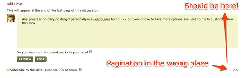
I’m In Like With You is a brand-new site that is best described as an online flirting site, or if you don’t mind the term, a “Web 2.0 dating site”. Think eBay + dating + Web 2.0 + social networks. When browsing people on the site, though, the pagination suffers from some serious “afterthought syndrome”: apart from having the last page number show up with an ellipsis before it, there seems to be no design to the pagination at all. The pagination is stuffed inconspicuously in a corner, page links are closely put together, they have underlines, no large clickable areas — all the classic signs, really.

Slate‘s pagination is heading in the right direction with larger (but still not quite large) clickable areas and no underlines, but the page numbers are actually stuck against each other.

Perhaps the best pagination I’ve ever seen is Flickr‘s: large clickable areas, easy to identify current page, detached Previous and Next links with arrows, and rather than First and Last links they make the first and last few links be a part of the page numbers with ellipses separating them from whatever current series of numbers you’re on. Below it all, the total number of photos is listed. The only comment I could give is to add more spacing, but I feel that their hover state makes this superfluous.
Virb’s pagination is very similar to Flickr’s and gets the nod of approval, too.
Chris sketched some comments on this one already, but the Magnolia pagination lacks clarity; tiny clickable areas, nearly no distinction between current page and any page link, and the whole thing feels strongly like a mere afterthought.

Twitter doesn’t really offer pagination, just two links to browse page by page. The links are underlined and feel like an afterthought, especially with a black bar separating them which actually adds to clutter rather than cleaning things up. If the bar had been twice as light in color it would’ve worked much better, or alternatively, with more spacing around it. On the whole, though, some proper visual design could make these links much more user-friendly.


These two pagination controls are from LiveJournal (top) and Engadget (bottom). They both don’t really offer pagination other than simply browsing next / previous pages (in the case of LiveJournal, the owner of the journal you’re browsing can specify the number of entries, which defaults to 20 but can be set to 1, for instance). The problem is that LiveJournal has a different perspective than Engadget thanks to its entries-per-page option: with LiveJournal, to go back in time to older entries, you have to click the “Previous ##” link; for Engadget, going back in time to older entries means clicking on the “Next Page” link. This contradiction is confusing for anyone who regularly browses sites that use conflicting approaches; a solution would be to be more specific: “Older Entries” instead of “Next Page” makes it clear where the link leads, no matter what.
Personally, I find Engadget’s approach a bit unintuitive: clicking “Next Page” to go to a page with previous entries (and “Previous Page” to go to a page with the next entries)? Sure, it’s the “next page” of entries in general, but they’re still previous entries, not “next entries”. This, to me, shows that it hasn’t been thought through carefully, but now they’re stuck to it (as I beileve this is simply a Weblogs, Inc. default).
Let’s look at some web comics, now.

Aside of the site still being a little broken-ish since its redesign long ago, Ctrl-Alt-Del online has some pretty decent pagination. The buttons are large enough to be easily clickable, but the First & Last links are inside the Previous/Next links, making it rather counter-intuitive if you also read a lot of other web comics that don’t have this flaw, or simply scour through pages of results on any site a lot.
VGCats has this same problem.

Least I Could Do has some good pagination, where they correctly use the First/Previous and Next/Last setup with large clickable areas and a decent hover state, but the Next and Last links are still links, even if you’re on the very last comic; bad UI. Very nice, on the other hand, is the visual distinction between non-pagination related links that are still in the same visual box: Comments and a “Save my place” link, though its purpose eludes me.

Penny Arcade has similarly decent pagination, but again the Next and Last (“New”) links are still links even on the newest comic page. Also, their buttons are relatively large in size but the text labels are pretty tiny, requiring more time than should be necessary for one to find the right link. Lastly, they only put the pagination at the bottom of the comic but sometimes their comics are very tall, requiring you to scroll down before you can navigate onwards (in whatever direction you’re heading).

Sinfest is good in not making the First and Previous links clickable on the first comic, but it lacks a Last comic link entirely; the only way to get to the latest comic is to go to the home page, but this isn’t immediately apparent (less so if you enter the site on a specific comic, rather than the home page). The chosen font also doesn’t make it particularly easy to distinguish between the three pagination links, and given that there are always only three, you really do need to read them to use them.
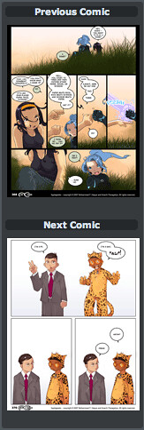
AppleGeeks (my personal favorite when it comes to art and coloring, these guys are nothing short of sublime) uses a very different style in pagination: a thumbnail version of both the Previous and the Next comic (wherever applicable). While intriguing, this approach is decidedly less intuitive thanks to being vertically oriented and does not always make browsing through the comic convenient.

OK-Cancel has great pagination: easy to identify First, Previous, Next and Last buttons, with large clickable areas, disabled links where links should be disabled and great hover states that obviate the need of spacing between the links.
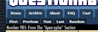
Lastly, there is Questionable Content. This is my all-time favorite web comic, but unfortunately the pagination could do with some work. The text links are really quite small, more so in the context of the rest of the page, with the main menu links right above them and the comic right below. The controls simply don’t stand out on the page at all, making them hard to spot and hard to use. There’s only about 10 pixels between the pagination links and the main menu links, the serif type does not help for the small text size, and the links are always links even when they shouldn’t be. All in all, a lot of improvements could be made to make these pagination controls much more usable.
Closing notes
Whew! That’s a lot of examples, and I’m sure you’re all “paginated out” by now, but please, take the seven rules above into account when building a site with pagination controls. Design them elegantly to ensure that your visitors get a pleasant experience when using them, and everyone will be grateful and happy.
All images hosted on Flickr on both my own and Chris Messina’s photostreams, with thanks to Chris for his encouragement and help in providing samples.
TEMPORARY NOTE:
Because I’m technically on a blogging-hiatus thanks to not having found the time yet to turn my site into a Django-powered one, this post is a bit isolated from the rest of the site; many elements were dynamically driven which, obviously, don’t update on a static site. However, it’s here for now and when I build the Django site all will be well again. This also means that comments are disabled, but if you have a Flickr account you can comment on this post on this Flickr screenshot of the blog post.
Written in parts on two contents and at 37.000 feet high.
